What Should Your Financial Pie Chart Look Like?
How to build a financial pie chart. Have you made a financial pie chart yet?
I’m a numbers girl. Always have been, and always will be. I see things in numbers and fractions and percentages. Budgeting and tracking my spending comes easy for me because of that. But if you’re a visual person, you might find it a little harder to stay aware of your financial situation.
So today, I want to look at spending a little differently – by using a pie chart. Your financial health is made of up a number of factors – your income and expenses, assets and liabilities, and future goals/spending plans. But perhaps the biggest thing you can do to change your financial situation is properly allocating your income between saving and spending.
Ideal Financial Pie Chart
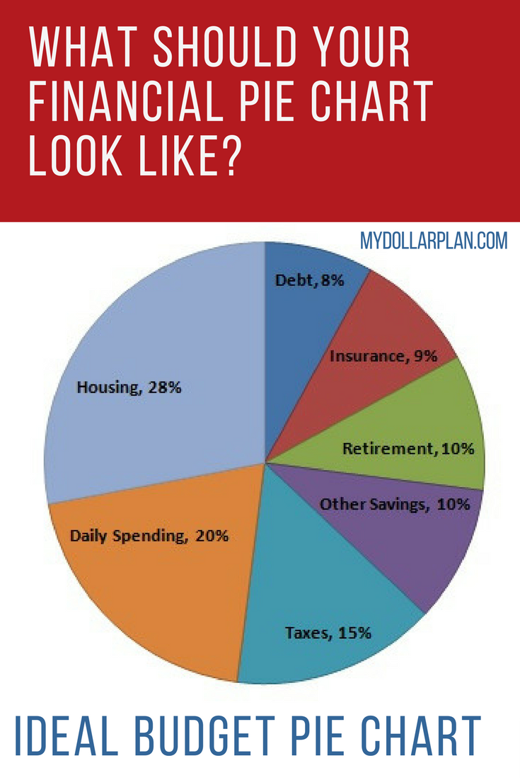
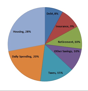
When I was taking my financial planning classes, my professor gave us some general metrics to use when assessing our clients’ financial situation. He then used a pie chart to show what the average person’s income breakdown should look like:
- Housing (including rent or mortgage payments, taxes and insurance): 28% or less
- Other Debt Payments: 8% or less
- Taxes: 15%
- Risk Management (life, auto, health, liability and any other insurance):9%
- Retirement Savings: 10%
- Other Savings: 10%
- Daily Spending: 20%
Here it is in actual chart form:
Ideal Financial Pie Chart
As you can see, only about 20% of your pre-tax income should be used for day-to-day spending! This includes things like bills, food, clothing and entertainment.
Make Your Own Pie Chart
You can use Excel to create a pie chart for you, or you can do one by hand. To use Excel, you can download the ideal pie chart worksheet and enter the numbers that apply to you.
If you want to make your pie chart by hand, do your best to break down your income into each of the categories named above. For each category, divide that amount by your total income, then multiply by 100. This will convert your spending in each category into a percentage. Draw a large circle and divide it in half. Draw four lines in each half to create 10 total sections. Each of these sections represents 10%. Fill in the chart using different colored pencils or markers, filling in portions of the 10 sections to represent categories that are more or less than 10%.
Download the Pie Chart Spreadsheet
Analyze Your Spending
Everyone’s pie chart will be a little different. The “ideal†pie chart I showed above might not be quite ideal for you depending on your current situation and future goals. If you have 6 kids you want to send to college, you need to be putting more in the “other savings†category. If your house is paid off, you should be spending much less than 28% of your income on just the taxes and insurance. And if you want to retire at 50, you might need to save more than 10% of your income for that purpose! But in general, the chart above is a good starting point for assessing your own spending.
Improve Your Pie Chart
If you can help it, you should actually strive to be under the above percentages for the housing, other debt payments, and daily spending categories. You should strive to be over the ideal percentages for retirement and other savings.
Look at 16 Ways to Lower Your Housing Costs if you are spending too much on housing.
Risk Management (insurance) and Taxes will depend on your individual situation, but in general, you should strive to spend as little as possible in both categories while maintaining appropriate insurance coverage.
To reduce your taxes, consider deferring more toward retirement or education savings. Additional 401(k) contributions will reduce your taxes; the amount depends on your tax bracket. Traditional IRA contributions will reduce taxes if you are under certain income thresholds and can deduct contributions. Roth IRA contributions will not reduce taxes now, but will help you save on taxes later. You may even qualify for the retirement savers’ credit! And if you are self-employed, you have a number of options for saving for retirement while reducing taxes.
If your pie chart looks drastically different from the ideal pie chart, check into some ways to increase your savings, decrease your debt payments, manage your insurance costs and cut your overall spending.
What does your pie chart look like? Tell us in the comments!


I had a wacky experience with a pie chart recently. When we looked at our expenses for 2010, we found housing was the biggest expense. Our second biggest expense was charitable giving. But we were horrified to find our third biggest expense was our dog. It was a freaky, emergency surgery that caused it but it was very disconcerting to see.
And because all our other expenses are so low, we didn’t have to spend so much on the dog to make it rise to the top. It was just a bizarre way to see that pie charts don’t always tell the whole story.
I am retired so I no longer have 10% put away from salary since I have none other than my IRA withdrawal and social security. The savings part is more an emergency fund but I am not as actively adding from my “earnings” since I am living off my savings. My house is paid off. I have no debts. My taxes are 22% of my income of about $30,000 a year. Withdrawals from IRA are taxed at normal rate. Insurance is 22% because as you get older the cost for health insurance goes up and so does life insurance since now they might actually have to pay. Housing which is now utilities and upkeep is running 17% of my income. Daily expenses for food, entertainment, and I am helping pay my sons college loans so that runs 40%. As you get older your Ideal pie chart gets quite a bit skewed. How about one for retired?
Hi Jill,
Thanks for a heads up! I find this very interesting as I haven’t tried it yet. I think the struggle in keeping this flowing throughout the month will be how will you able to sustain each need. But I’ll give it try and see if it works!
I’m out of whack in a few areas … thanks for the reality check!
Great article, share with my wife. She is against budgeting because in most of time she is simply not good at following the budget. It gives her a good idea how she should be thinking about spending.
Hi Jill,
Everyone’s financial pie chart is going to look slightly different because everyone has different priorities which will affect the look of the chart. Don’t compare yourself top others.